


We are very excited to announce that we redesigned our monitoring results chart to make it easier for you to understand check performance over time and easily investigate any past anomaly.
The redesign is a result of our UX research that showed that the old check overview chart made it challenging for users to find check results from the past.
While we were redesigning our monitoring results charts, we wanted to achieve two things:
- provide a helicopter view of the check health
- clearly highlight any anomaly and show it in just a couple of clicks
And, we achieved this in three attempts. Let’s dive in.
Third Time’s a Charm – How We Iterated to the New Look
We had to create a check overview page where users could access both large and small scales of data. The idea was to easily change the scale from very aggregated, without many details, to very detailed.
And we didn’t achieve this on the first attempt:


The first chart provided too much aggregation and did not allow for drilling down into problematic results (though it looked like a Pollock masterpiece).
The second attempt also didn’t achieve what we wanted:
The ribbon (that’s what we called it) we had in this iteration did the opposite of what a chart would do–it allowed the user to see all individual bits, but gave no ability to see the full picture.
So our third attempt is a perfect (we hope!) combination of both scales. The check overview page now has an interactive chart (or what we call a helicopter view) which allows you to open individual results for any time bucket and see atomic individual runs. This allows for fast deep dives into check reports to understand and resolve incidents.
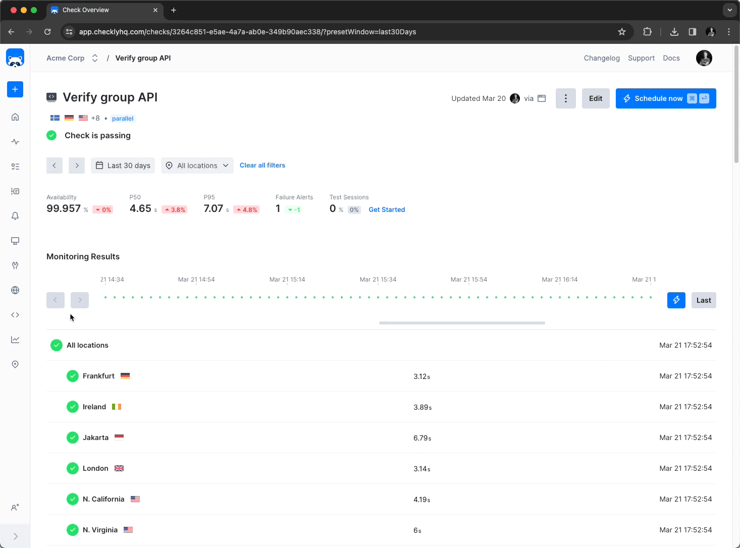
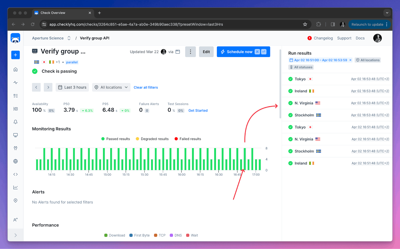
Check Overview Chart Improvements
The new check overview chart comes with a side panel where all check results from the selected time period are visible. This allows for fast deep dives into check reports to understand and resolve incidents.
This view enables you to:
- Get a better understanding of your check’s historical health
- Find specific check results easily
As before, the chart allows you to filter on time range and locations to get more detailed statistics.
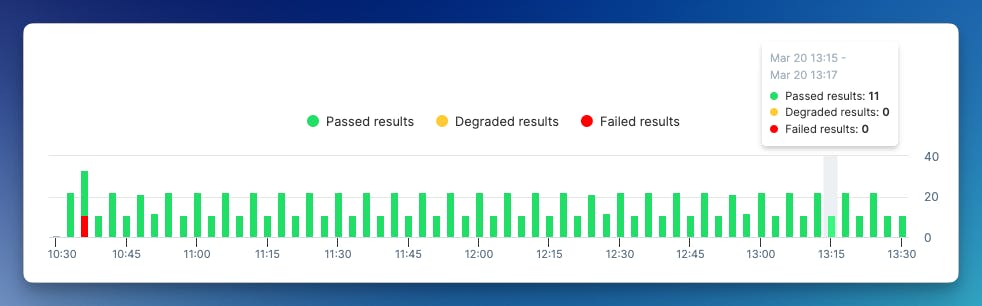
However, now we have bars for a clear overview of the check results. Each bar on the chart represents a narrower time range and shows the aggregate of all check runs that happened in that time. Moreover, the color coding allows for fast identification of failing runs.
Selecting a bar in the new chart further filters out the results in the sidebar, allowing you to quickly navigate to any given check result.
The current solution is a team effort inspired by users and boosted by their feedback. Internally, the late ribbon component now is the measure of inconvenience. If you feel some blame reading this, don’t, please continue to give your feedback to us so we can do better on each next attempt.
Check out the full overview here:
To sum up, this is what we did to deliver a great user experience:
- we collected A LOT of information about user needs and their expectations–we had interviews and we constantly talked to our customers (as one of our core values),
- we built a prototype with mocked data and tested it with users, asking them to perform some tasks that used to be challenging,
- we iterated the prototype according to the feedback we received
- we delivered the current solution (which you can now see live)!
We hope the new chart will help you not only to navigate to check runs you are interested in quicker but will also point you to the most interesting information. We will continue asking for your input, and we’re always happy to take your feedback in our Slack Community.