It was only as I started to study information theory that I truly understood how nonsensically the computer worked in Star Trek: The Next Generation.
Decades before voice assistants and at a time when only the most basic language parsing existed in practice, the computer on Star Trek could always give you the answer you wanted. No one ever spent any time clicking into multiple windows to find an answer, and the display always gave information that could be easily summarized in words. When an explosive hit the starship, the computer could say things like ‘Hull integrity at 75%’ without a moment’s pause.
This was just narrative convenience, a bit like surveillance camera footage on a cop show that always managed to capture the right angle. But unlike other well-timed phone calls or our hero’s flashlight running out of battery at just the right moment, it’s interesting to talk about why computer systems can’t actually summarize data that’s complete, universal, and easy to understand. What better example to start with than the Star Trek of the 1990s, where every computer display was really a Single Pane of Glass.
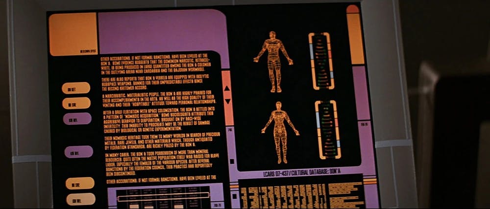
No one ever spends hours scrolling to find an answer in the universe of Star Trek. Pictured is an ‘Okudagram’, the fake computer interface designed and produced by Art Department Manager Michael Okuda in 1986
Why everyone dreams of a Single Pane of Glass
The quest for a "Single Pane of Glass" (SPOG) in Application Performance Monitoring (APM) is often misguided. The concept, while appealing in its simplicity, fails to address the complexities and nuances of modern software systems and the diverse needs of those who monitor them. This perspective is supported by insights from both community discussions and expert analyses.
Reddit user wiredone puts it well:
Man, I hate Single Pane of Glass. I much prefer Observability because you never actually get a single pane of glass. No one actually wants to log in. No one but SRE and Platform engineers want to see the pretty graphs and dashboards. Security certainly won't look at the tools you provide them. They want to see that the check boxes are all green.
The critique highlights a fundamental issue: the actual utility of SPOG is limited to a narrow audience (SREs and platform engineers), while other stakeholders, like security teams, have different requirements that are not met by a generic, all-encompassing dashboard.
The Medium post titled "The Single Pain of Glass" by Jamie Allen further elaborates on the limitations of SPOG. The post recounts experiences where dashboards, despite their visual appeal and the aggregation of numerous metrics, fail to engage the teams responsible for monitoring these metrics. After Operations put up fancy displays with critical performance metrics next to their cubicles:
Teams would get up and go to lunch and walk right past the dashboard, not noticing if there was an incident in progress. The large screen and the contents of the dashboard almost felt like they were largely for show, to impress others who walked by.
A key takeaway from the post is the argument against the feasibility and effectiveness of SPOG in complex, global deployments. It illustrates the impracticality of representing multifaceted metrics (such as error rates across different regions and deployment models) in a single dashboard. The proposed alternative focuses on simplicity and actionability: a dashboard that uses color codes to indicate the status of observed metrics relative to their Service Level Objectives (SLOs), supplemented by secondary and tertiary dashboards for in-depth analysis. This approach aims to provide clear, immediate insights into the health of a system, directing attention to where and why problems occur, rather than overwhelming users with dense, often ignored, information.

The only ‘single pane of glass’ information display that’s readable fast enough to be useful.
The critique of SPOG, both from the community and expert perspectives, underscores a broader principle in software monitoring: the goal is not to aggregate as much information as possible into a single view, but to present relevant, actionable insights in a manner that is immediately useful to its audience.
A pane that is also a mirror, and also a magnifying glass
The requirements we place on even a theoretical ‘Single Pane of Glass’ are so contradictory as to reveal the impossibility. We want a single dashboard that:
- Tells us the problem quickly; there’s no point in the tool if we can’t diagnose an outage fast
- Aggregates data from everywhere. If it includes multiple black boxes (and searching logs or traces in another tool), there’s no point in gathering data here
- Works for everyone in the org, we need buy-in from many teams to make sure the dashboard stays up-to-date and accurate
In general, these three requirements form a pretty good triangle of mutual exclusivity. Consider:
- A tool with in-depth data from every system everywhere will have too much production info to be okay to give access to everyone on every team
- Highly detailed data about what’s actually going on in the system is too fine-grained to show overall performance, conversely a summary of overall performance may conceal a great number of problems hidden in logs and trace details
- A tool that’s really taking every single log, trace, and metric from every other service and presenting it in a fast, performant interface is going to be highly expensive to run. If we really want to share it with everyone from Sales to Support to the C-suite, the cost of constant queries will likely get us into the danger zone where our Observability costs more than our Infrastructure
A Single Pane Of Glass is a Manager’s Dream
Why then do we persist in this quest? In a way, the Single Pane of Glass is a manager’s dream: it serves as a portal for a manager to monitor systems and get summaries instantly. It also lets management define the most important measurements, and communicate performance to those measurements quickly and clearly to the team. It may not be that anyone’s seen the One True Dashboard in action, but if it did exist, surely the manager of that team would be up for a bonus.
Synthetics -or- Is all this observability worth anything if you can’t connect it to user impact?
When we think of being ‘on the outside looking in’ it sounds like a terrible social situation, like the heroes of Saltburn or The Talented Mr. Ripley. But when we talk about a single pane of glass we’re generally understood to describe a system that observes everything happening inside a service; this begs the question: what’s going on outside the system? How does our service work for our users? You’re users aren’t excited about lowered DB response times or efficient compute usage. Your users only care about how your service works when they try to interact with it. To know how your service is actually working for the people who matter most, you need synthetic monitoring.
Synthetic monitoring, or testing your site with an automated browser and simulating user interactions, connects all the systems that are involved in handling real users’ requests. No matter how great our applications’ logs or traces look, synthetic monitoring will reveal if users can actually log in, perform account actions, and retrieve their information. With well configured synthetics, you never need to wonder whether your site is really up or not.
Tools like Checkly synthetics let your team design tests that simulate complex user behavior, and document the results with deterministic tests, capture screenshots, and even run visual regression checks.
Getting Better Observability for Free
We all want a shiny new dashboard. I took a look in a factory-new car the other day and all I could think was ‘long iPad’

Promotional image from RoyalKia.com
But instead of buying the shiny new tool that will combine every byte of data into one super dashboard, how can we improve observability at almost no cost? By improving understanding:
- Brown bag knowledge sharing will enhance observability: the better teams’ understand what others are doing, the more quickly they can diagnose problems.
- Prioritizing the data generated by synthetic user tests will help prioritize the users’ actual experience. If you’re already generating these numbers, all you need to do is tie more of your performance measurement to the level your service actually performed.
- Standardizing event formatting and context propagation enhances observability: if you make logs and traces readable by other teams, you do a lot to improve observability for only the cost of reformatting your log calls.
- SRE Runbooks improve observability: By knowing who to wake up from critical teams during an incident, and creating processes to get in touch, we increase the likelihood that the right person will see critical data sooner and get us all an explanation for what’s going on. A little time spent now formalizing incident response can save hours of trying to diagnose a problem
I always want to spend a little operational budget instead of taking time doing paperwork, but in this context, I think we need to let industry standards guide us: the way to reduce incident response times is by having good team knowledge and practices, and not with a new tool that promises a ‘Single Pane of Glass,’ for real this time!
Conclusions: break beyond the pane of glass
Observability, as a practice, extends beyond the confines of a single dashboard, embracing a more nuanced, targeted approach to understanding and diagnosing systems. This philosophy acknowledges the complexity of modern software environments and the varied needs of those who maintain them, advocating for tools and practices that enhance clarity, not just coverage.
If you’d like to talk about how to go beyond internal monitoring and the single pane of glass, consider joining the Checkly Slack. If you’d like to see the things a standard Application Performance Monitoring tool won’t tell you, join me for a webinar with Kentik’s Leon Adato on ‘Beyond APM.’ Hope to see you there!