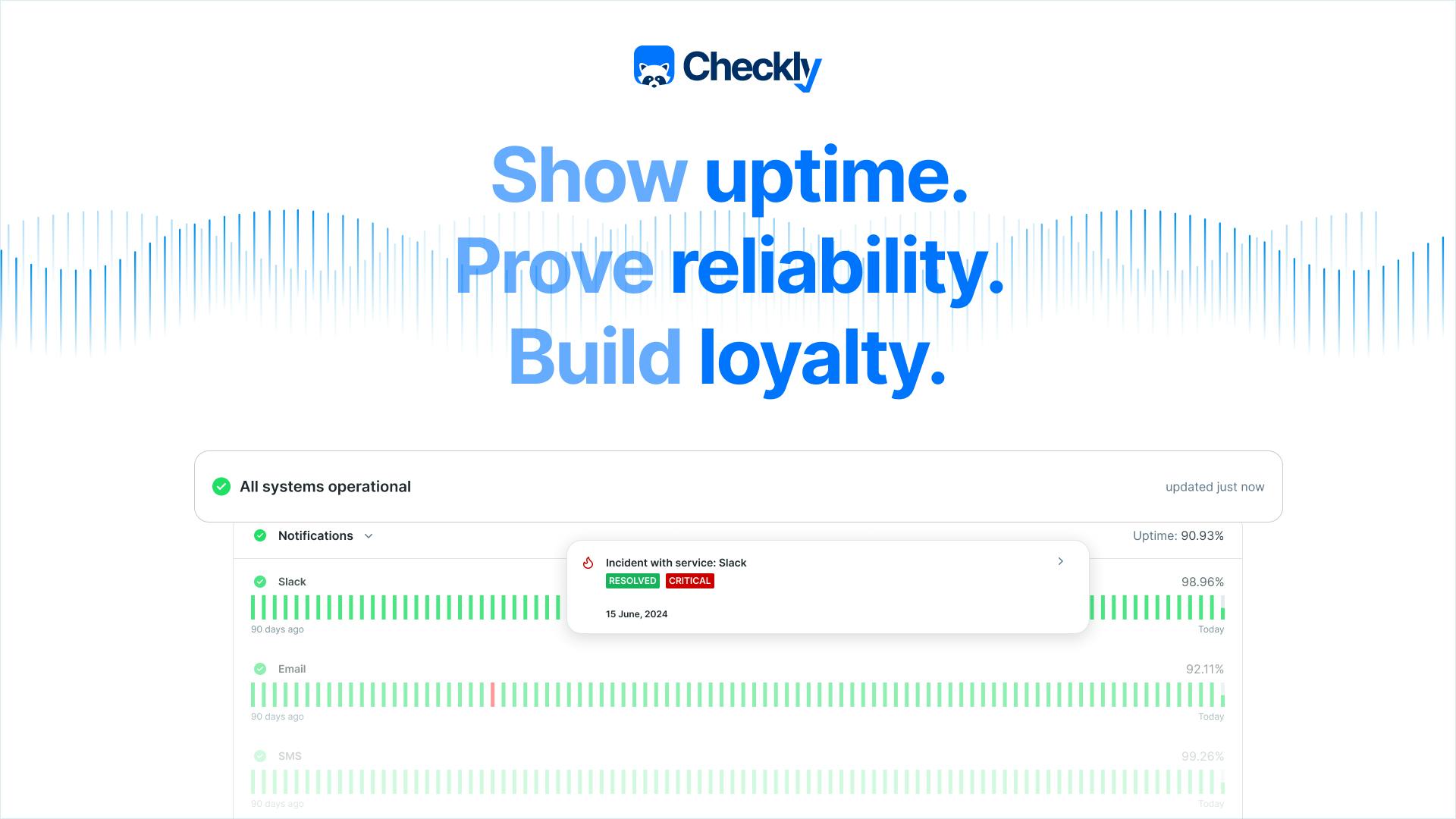
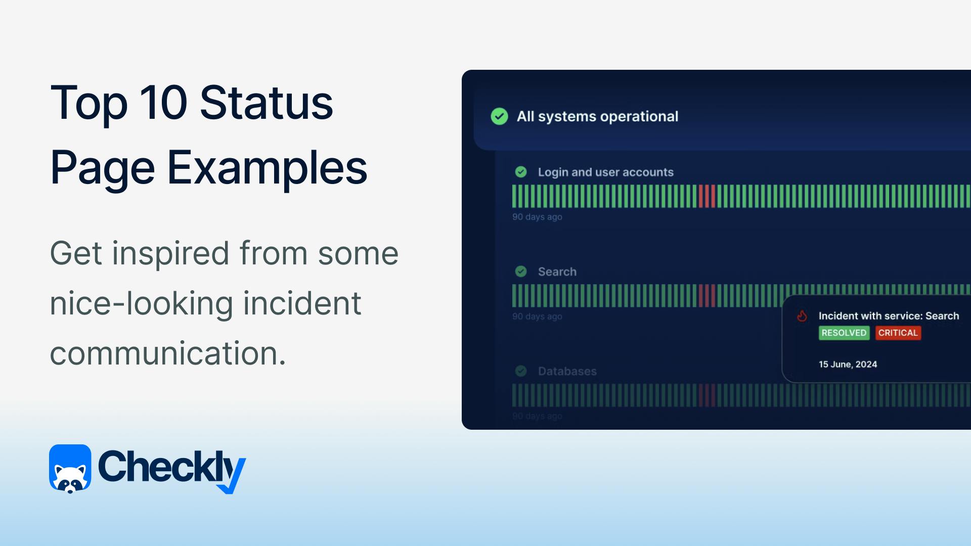
A great status page does more than show uptime—it builds trust, communicates clearly during incidents, and empowers users to stay informed.
Here are 10 standout examples of public status pages, with a quick breakdown of what they do well—and where there’s room for improvement.
1. Notion

Notion’s status page is clean, minimalist, and aligned with the company’s brand.
What’s good?
It uses a simple, color-coded history view and real-time incident updates with clear timestamps. The branding is subtle but consistent.
What’s missing?
Historical uptime is available but not clearly visible at first glance.
2. Slack

Slack offers a robust and detailed status page that reflects the modular nature of its product. Users can quickly check the health of messaging, APIs, calls, and more.
What’s good?
Component-level visibility, real-time updates, and Slack-based alert subscriptions.
What’s missing?
Historical uptime is available, but there’s no obvious differentiation with colors between colors and incidents. It’s in the form of a calendar where you have to click on a date to see if anything happened that day, which makes getting information a bit harder.
3. Intercom

Intercom’s status page is polished and well-organized, reflecting their customer-first approach. It offers real-time updates and a clear view of service components.
What’s good?
The page is very clean, and all information is grouped into logical services. We really like the ability to subscribe to updates and the extensive details available when there’s an outage happening.
What’s missing?
The historical view includes only an incident list, there’s no calendar view.
4. Dropbox

Dropbox opts for a straightforward, end-user-friendly status page. It shows at-a-glance uptime and incident history without overloading visitors with technical details.
What’s good?
We like the additional links to the help center and the community in the menu. This will make it easier for users to find the solution if they have a problem with some of the services.
What’s missing?
The design of the page could be more compact and modern. You need to scroll way down to get to historical data, for instance.
5. LinkedIn

LinkedIn’s status page provides a good overview of platform health. It covers major app surfaces and is easy to navigate.
What’s good?
It’s very easy to find the part of the platform that you’re using as the services are split into Member experience, Business solutions, and Developer tools.
What’s missing?
We’d love to see some more details when one of these cards is expanded. Additionally, there’s no historical uptime available on the page.
6. Digital Ocean

DigitalOcean provides a developer-friendly, detailed status page with infrastructure transparency. It includes historical data, incident posts, and maintenance schedules. Users can subscribe to updates or follow the status updates on Digital Ocean’s dedicated X profile.
What’s good?
There are quite a lot of details when it comes to scheduled maintenance and incidents, tailored to the users of Digital Ocean. Services are also well-organized and easy to find.
What’s missing?
The design of the page could be a bit more modern. Furthermore, the historical uptime page is a bit difficult to navigate, containing a lot of text and no calendar view.
7. Reddit

Reddit keeps things casual with a status page that matches its quirky brand. It’s informative, timely, and feels approachable to both technical and non-technical users.
What’s good?
We really like the simplicity and the clean design of the page. All services are grouped, and when you expand a card, you can see a nice showcase of the uptime of the last 90 days, with clear color differentiation between uptime, partial outages, and incidents.
What’s missing?
To get to past incidents and the link to the historical uptime page, you need to scroll way down.
8. Coinbase

Coinbase’s status page reflects its financial reliability, with granular service breakdowns and detailed incident logs. It’s built for high stakes and high traffic.
What’s good?
Excellent transparency across services, with clearly structured updates. The platform obviously has a lot of services and the site is designed to showcase all of them. The ability to subscribe to updates is also always a nice addition.
What’s missing?
The incident history page contains a long list of incidents which might be hard to navigate. We’d love a calendar view and color differentiations.
9. Netflix

Netflix uses a simplified “Is it down?” page to report service status. No services, no details. It’s geared toward non-technical users and prioritizes ease of use.
What’s good?
The simplicity. Everyone can understand this page, and that’s the point. It’s also very clear what you need to do if you still have a problem with the streaming service.
What’s missing?
If you’re a more technical person, you might not like this page. It lacks historical data, incident transparency, and technical detail.
10. Wistia

Wistia provides a clean, easy-to-understand status page for its video hosting and analytics services. It includes uptime and incident logs for specific services.
What’s good?
Nicely categorized service components and a reliable update cadence. Incidents are broken down by service, and you can view historical performance trends. The subscription options (email, webhook, and RSS) are great for keeping stakeholders informed.
What’s missing?
The incidents in the historical view are a bit hard to notice due to the color palette used.
Why do you need a status page?
First, customer trust.
Customer trust is built through consistency, transparency, and proactive communication—especially when things go wrong. A clear, reliable status page shows your users that you're honest about incidents and committed to keeping them informed.
By sharing updates early, explaining what happened, and showing progress in real time, you reassure customers that you're in control and accountable.
Also, your support team will appreciate it. When people can quickly check your status page for updates, they’re less likely to file tickets or flood your support team.
Why do you need an automated status page?
An automated status page takes the manual work out of incident communication by reflecting real-time monitoring data, so your users always see the current state of your services.
When your monitoring and your status page are connected in a single tool, incidents are detected, reported, and communicated instantly. This not only reduces response time but also ensures consistency between what your team sees and what your users are told. It streamlines workflows, eliminates context switching, and helps you stay transparent without extra effort.
Status page best practices
Based on what we liked and didn’t like about these pages, here are some best practices we want to point out:
- Use a clear and consistent URL (e.g. status.yourdomain.com)
- Make your status page link visible and accessible
- Look for a monitoring tool that will provide an automated status page to eliminate tool hopping and cut costs
- Communicate proactively and don’t wait for users to notice issues
- Use simple and honest language to say what’s wrong
- Adapt to your audience—include technical details if your audience can understand them
- Enable real-time notifications for users who want to subscribe
- Add historical uptime transparency
- Stay consistent with your branding
Conclusion
A well-maintained, automated status page isn’t just a nice-to-have—it’s a core part of delivering reliable software and building user trust. By combining monitoring and incident communication in one place, you cut support load, keep users informed, and stay in control during outages.
With Checkly, you get end-to-end monitoring, issue detection, and a fully integrated status page—so you can catch issues early and communicate fast, all from a single tool. Find out more.