Documentation Index
Fetch the complete documentation index at: https://checklyhq.com/docs/llms.txt
Use this file to discover all available pages before exploring further.
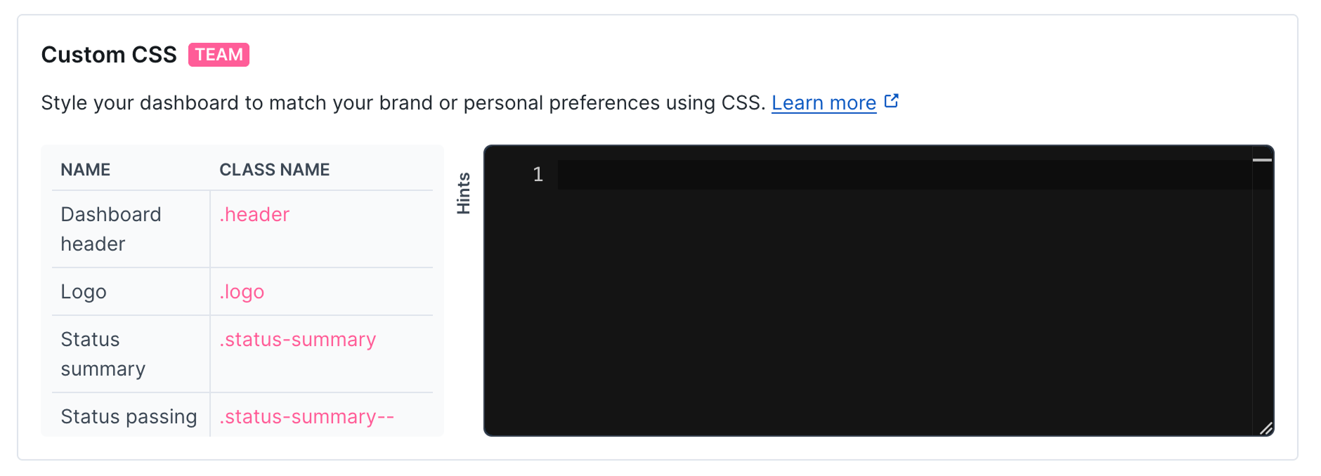
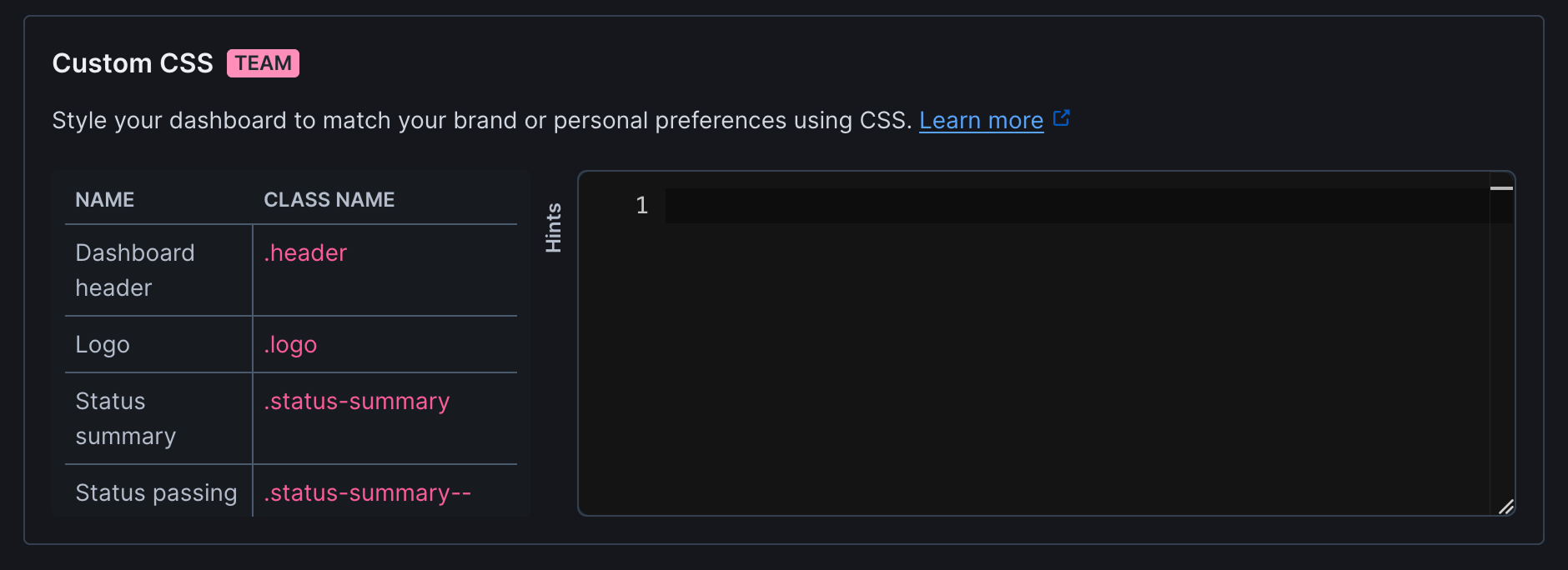
You can completely customize the look & feel of your dashboard using custom CSS rules so the dashboard fits your company’s
branding guidelines. You can find the CSS editor at the bottom of the Look & Feel section.
Editing works like this.
- Start by opening your dashboards in a separate browser tab.
- Generate some boilerplate CSS code by hitting the Generate boilerplate button.
- Open the hints tab so see all the classes available for you to target.
- Make some edits, hit Save dashboard and reload your dashboard.
Custom CSS is only available on certain plans. For more details, see our Pricing page. CSS Classes
The following table lists the CSS classes available for customizing your dashboard appearance:
| Name | Class name |
|---|
| Dashboard header | .header |
| Logo | .logo |
| Status summary | .status-summary |
| Status passing | .status-summary--passing |
| Status failing | .status-summary--failing |
| Main content | .main |
| Incidents summary | .incidents-summary |
| Check | .check |
| Check result | .check__result |
| Passing check | .check__result--passing |
| Failing check | .check__result--failure |
| Degraded check | .check__result--degraded |
| Check metrics | .check__metrics |
| Check list | .check-list |
| Empty check list | .check-list--empty |
| Time range | .period |
| Active time range | .period--active |
| Time range selector | .period-selector |
| Pagination | .pagination |
| Incident | .incident |
| Incidents page | .incidents-page |
| Incidents detail page | .incidents-detail-page |
| Incident list | .incident-list |
| Incident list date | .incident-list__date |
| Active incident list | .active-incident-list |
| Active incident card | .active-incident |
| Major incident | .active-incident--major |
| Minor incident | .active-incident--minor |
| Incident header | .active-incident__header |
| Metric | .metric |
| Metric improved | .metric--improved |
| Metric worsened | .metric--worsened |
| Metric badge | .metric__badge |
| Dashboard footer | .footer |
| Error 500 | .error-500 |
| Error 400 | .error-400 |
| Login background | .login-background |
| Login box | .login-box |
| Login input | .login-input |
| Login button | .login-button |
| Login social button | .login-social-button |
| Logout button | .logout-button |
| Logout icon | .logout-button__icon |
Styling examples
We created some examples of how you can style your dashboard using the brand colors from well known brands. This should
help you explore the possibilities you have available.
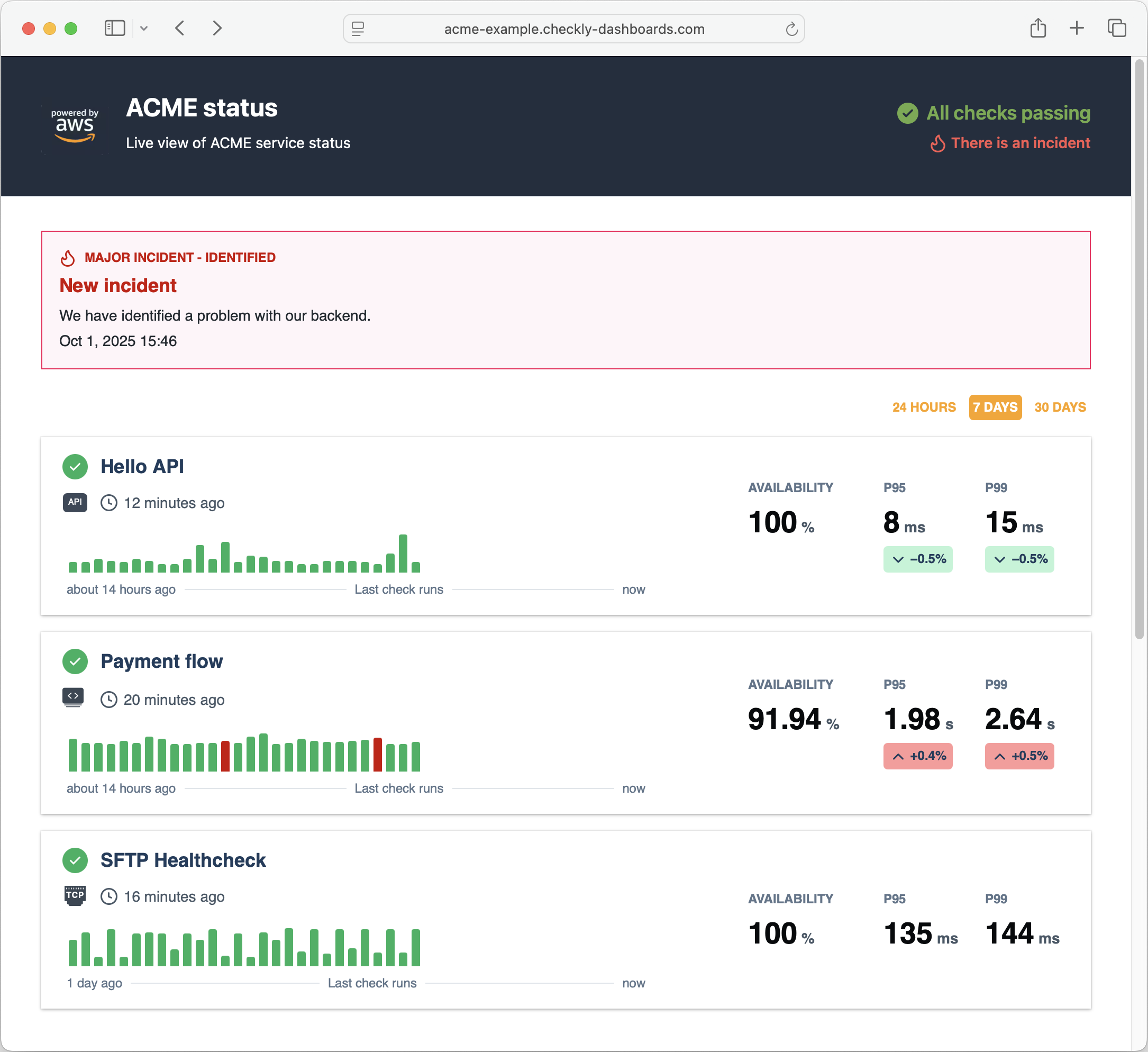
Amazon Web Services style
In this example we aim to replicate the brand style of Amazon Web Services (AWS).
Note the following:
- We set a dark
background for the header with light color text. We also tweak the status and incident summary.
- We set the link
color to the orange brand color.
- We remove the
border-radius on the check cards and add a box-shadow.
.header {
  background: #232e3e;
}

.header .logo a {
  color: #fca311;
}

.header h1 {
  color: #FFFFFF;
}

.header h2 {
  color: #FFFFFF;
}

.status-summary--passing {
  color: #70ab4a;
}

.status-summary--passing svg {
  fill: #70ab4a;
}

.incidents-summary {
  color: #f95a53;
}

.main {
  color: #1f3d5c;
  background: #FFFFFF;
  font-family: Helvetica;
}

.check {
  box-shadow: 0 1px 3px 0 rgb(0 0 0 / 30%), 0 0 0 1px rgb(0 0 0 / 4%);
  border-width: 0;
  border-radius: 0;
}

.active-incident article {
  border-radius: 0 !important;
}

.period-selector a {
  color: #fca311;
}

.period-selector .period--active {
  background-color: #fca311;
  color: #FFFFFF;
}

.metric {
  color: #1f3d5c;
}

.incident-list a {
  color: #0972d3;
}

.footer {
  background: #232e3e;
}

.footer .logo a {
  color: #e47911;
}

.footer h1 {
  color: #FFFFFF;
}

.footer h2 {
  color: #FFFFFF;
}
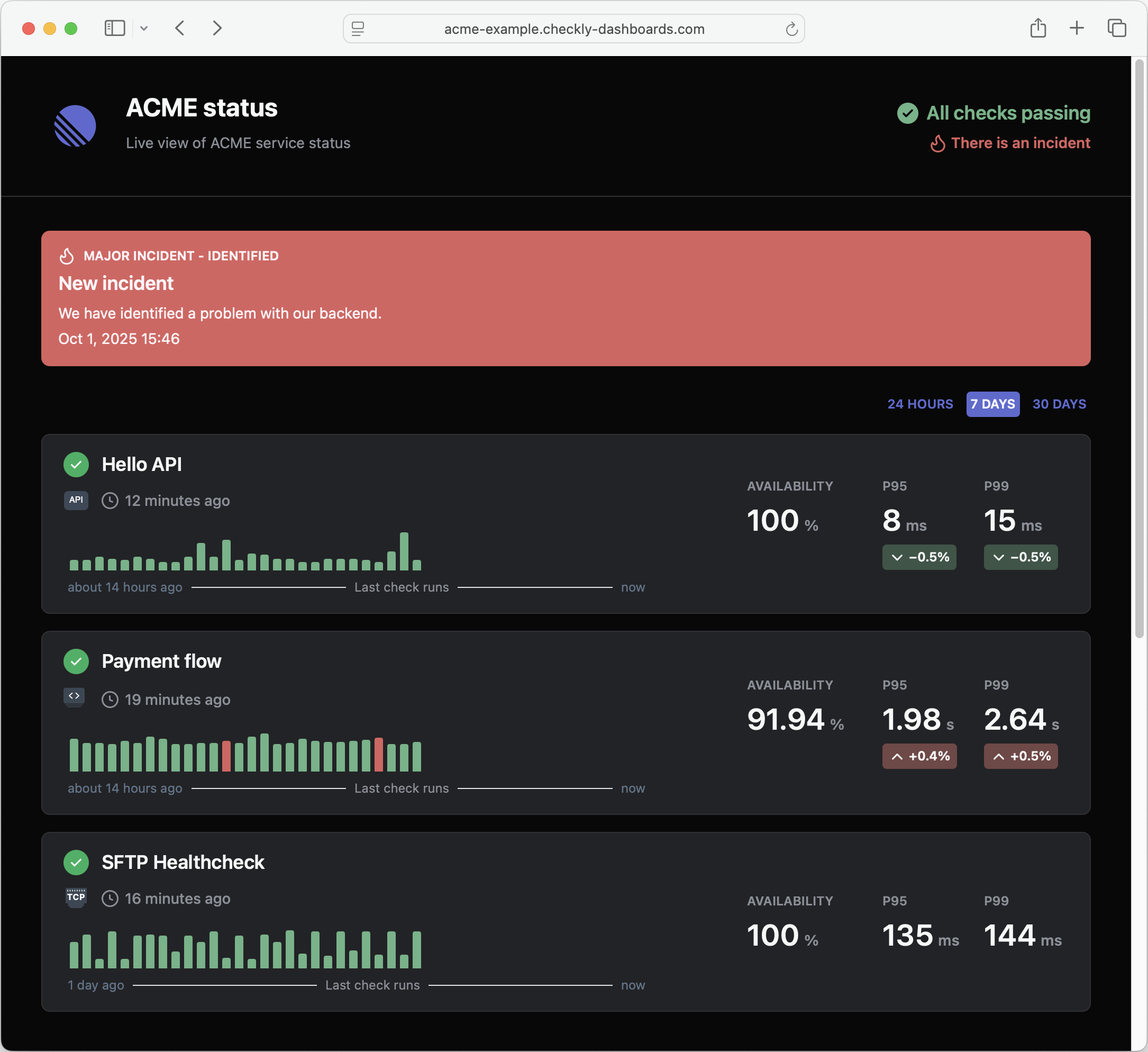
Linear style
In this example we aim to replicate the dark style of Linear.
Note the following:
- We set a dark
background for both the header and main sections.
- We set a lighter
color for a range of text elements to contract with the dark background
- We set a new color pattern for the big red incident alert at the top of the page.
- We tweak the brand “red” and “green” colors to better match the palette.
.header {
  background: #080808;
  border-bottom-color: #313035;
  font-family: "SF Pro Display",-apple-system,BlinkMacSystemFont,"Segoe UI",Roboto,Oxygen,Ubuntu, Cantarell,"Open Sans","Helvetica Neue",sans-serif;
}

.header .logo a {
  color: #f7f8f8;
}

.header h1 {
  color: #f7f8f8;
}

.header h2 {
  color: #8a8f98;
}

.status-summary--passing {
  color: #68b487;
}

.status-summary--passing svg {
  fill: #68b487;
}

.incidents-summary {
  color: #db615f;
}

.main {
  color: #1f3d5c;
  background: #080808;
  font-family: "SF Pro Display",-apple-system,BlinkMacSystemFont,"Segoe UI",Roboto,Oxygen,Ubuntu, Cantarell,"Open Sans","Helvetica Neue",sans-serif;
}

.check {
  color: #f7f8f8;
  background-color: #222326;
  border: 1px solid #313035;
}

.check > div > div span {
  color: #8a8f98;
}

.active-incident--major article {
  background-color: #db615f!important;
  color: #fff5f9;
  border-width: 0;
}

.active-incident--major article > .active-incident__header div {
  background-color: #db615f;
  color: #fff5f9;
}

.active-incident--major article p {
  color: #fff5f9;
}

.period-selector a {
  color: #5E6AD2;
}

.period-selector .period--active {
  background-color: #5E6AD2;
  color: #f7f8f8;
}

.checks-stat.metric > div {
  color: #8a8f98;
}

.checks-stat.metric > div > div {
  color: #f7f8f8;
}

.checks-stat.metric span {
  color: #8a8f98;
}

.metric--improved .metric__badge {
  background-color: #3b5546 !important;
}

.metric--worsened .metric__badge {
  background-color: #734746 !important;
}

.metric__badge {
  color: #f7f8f8 !important;
}

.check__result--passing::before {
  background-color: #68b487;
}

.check__result--failure::before {
  background-color: #db615f;
}

.incidents-list-date {
  color: #f7f8f8;
  border-bottom-color: #313035;
}

.incident-list p {
  color: #8a8f98;
}

.footer {
  background: #080808;
}

.footer .logo a {
  color: #f7f8f8;
}

.footer h1 {
  color: #f7f8f8;
}

.footer h2 {
  color: #f7f8f8;
}
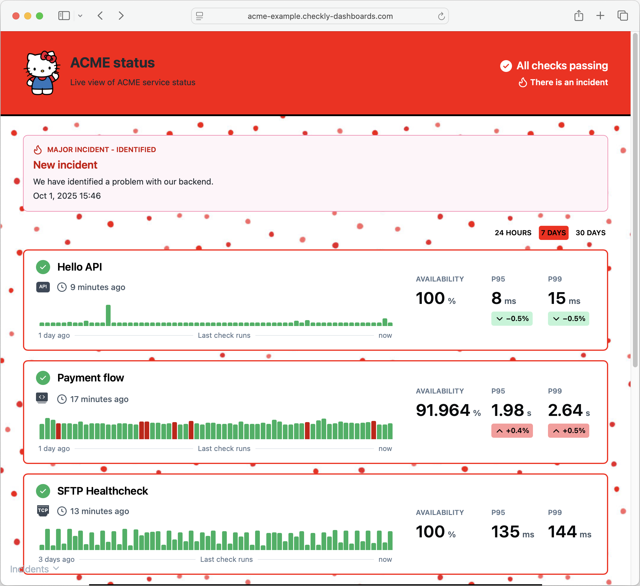
Hello Kitty style
“Why so serious?” you might ask. No reason, you can go crazy with styling, adding repeating backgrounds and images.
.main {
  background: url("https://media.istockphoto.com/id/973856976/vector/simple-seamless-pattern-with-irregular-polka-dot-endless-print.jpg?s=612x612&w=0&k=20&c=ieek3r4Th_CyV73WsfoCYUhpz7-INHqWRZ6ZpRmASrs=");
}

.header {
  background: red;
  border-bottom: 3px solid black;
}

.status-summary {
  color: white;
}

.status-summary--passing {
  color: white;
}

.status-summary--failing {
  color: white;
}

.incidents-summary {
  color: white;
}

.footer {
  background: red;
  border-top: 3px solid black;
}

.footer span {
  color: white;
}

.period {
  color: black;
}

.period--active {
  background: red;
}

.incident-list {
  background: white;
  padding: 0px 30px;
  border: 2px solid black;
}

.check {
  border: 2px red solid;
}